


INTRODUCING: ARENBERG 68 DESIGN
As we launch our first new print for 2018, The Handmade Cyclist’s creative director Neil Wyatt talks about the inspiration for its design – cobbles, sludge and Eddie Merckx.
The inspiration behind all your designs is always either a brilliant story or a ride that has real meaning. Would you say that with Arenberg 68 you got both?
Absolutely. As a bike race to watch, for me there’s none more exciting than the Paris-Roubaix. It's like watching the Grand National. It’s got that element of chance and that old school heroism and courage. Plus this year is the 50th anniversary of the first time the race went through the Arenberg Forest.

The Arenberg stretch was introduced when a retired rider – Jean Stablinski – convinced the organisers that the race wasn’t tough enough and that he knew a track that would really put the cat amongst the pigeons. But that’s another story! Eddie Merckx was the winner that year. That first year, 1968, when they first rode through the Arenberg forest, Merckx was World Champion. It’s the year he won his first Paris-Roubaix and he’d attacked going through the Arenberg.
There’s a piece of video footage on YouTube which has him riding through the forest and he turns to the camera and almost smiles as he’s leaving everyone behind. He didn’t ride solo from there but he made the selection and then won from that group. It was a legendary attack. The print is capturing that moment.
Which elements of the story guided your design process?

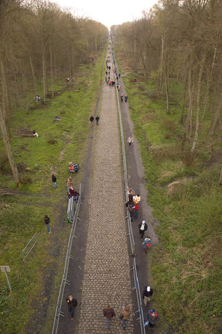
The pattern is inspired by the Paris-Roubaix cobblestone trophy – the trophy is one of the actual cobblestones. The bottom part of the image, with the blocks of colour, is the base of the trophy, the plinth. The centre part of the print, the spike, is the classic shot of the Arenberg forest going off into the distance. There’s a bridge across the track in the forest, an old mining bridge. That’s the view from the bridge. Then to give the whole thing perspective, we have Merckx riding into the distance in his world champs jersey. The whole design is an homage to that day.
How did you choose the colour palette for the print?
On the Arenberg T-shirt range we went for a restricted colour palette that was inspired by the region. Basically, the sludgy, wet, northern French spring. For the print, we had a mood board and created a colour palette from that. We kept the background quite dark – which is to make Merckx stand out more. On a lighter background it just didn’t work, because he’s so tiny. But he needs to be tiny to get the perspective of the road. The dark greys of the cobbles contrast with the green and the acid yellow to represent the first shoots of spring ¬– a pop of colour in amongst all the sludge.

What did you use for source material for your Merckx illustration?
Sometimes it’s just finding a photo of someone in the right kind of pose. But that can be really hard – you need to get them at just the right angle and perspective. So quite often I’ll get loads of different photos and then just work it out, adjusting it until the perspective and angles are right. With this Merckx one, I wanted to put his race number from that day on the print. It’s really hard to find race numbers from past events. But I found this photo of him riding into the distance, the view from behind, putting the power down and riding away. Brilliant.
